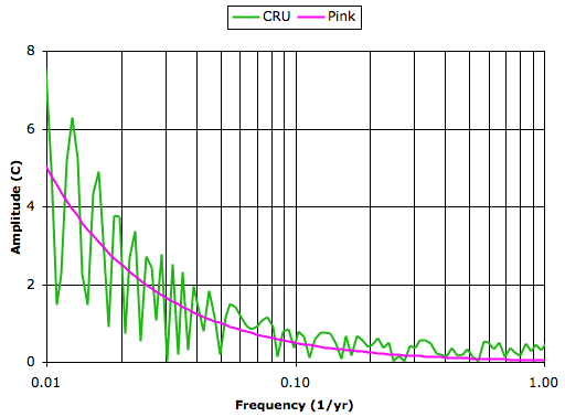
The global surface transform jumps up and down because we have only a few hundred points from which to obtain the transform. Nevertheless, the trend in the transform is clear. The transform follows the pink noise transform up to 0.5 cycles/yr, and flattens out like white noise.
Our recent climate history looks like pink noise added to some white noise. It looks like its a sequence of random fluctuations. I challenge anyone to prove to us that our recent climate history is not random. Until we have such proof, it is our duty to assume that the climate is random.

I'm a SME on low frequency FFT's and other time series analyses.
ReplyDeleteIt's rather obvious that you need to plot the power spectrum (energy density) on a linear frequency scale.
Did you demean the time series? Or do a linear detrend? Because you should not, particularly when that has the largest signiture (RE: see tide spectra versus wave spectra).
What were the DOF's and did you do band averaging or segment averaging?
Also the very process you are doing an FFT analysis on is not stationary (aka ergodic), so basically the FFT method is a very poor choice here.
Did you window the raw data? If so, why?
Care to publish this in a peer reviewed journal article?
Gavin Schmidt DESTROYED you in a single word.
ReplyDeleteYou are so outclassed it's hilarious.
Yes, that's where I found your post to this ridiculous and very flawed analysis.
ReplyDeleteMilankovitch cycles. Important on a scale of tens of thousands of years, 41kyr and 100kyr, for example.
The temperature data is O(2) or less than 160 years.
So let's divide 160/41,000 ~ 0.004
So let's divide 160/100,000 ~ 0.0016
Or almost O(3) lower in frequency than the temperature data.
Amplitude versus log(f), very funny stuff, from a rank amateur.
I don't think you can even answer my questions.
You don't display any aptitude for even the basics of FFT analysis.
Pink noise. Ha. White noise. Ha.
But I tell you what, you do your blind man's FFT on the temperature data and extract the 41kyr and 100kyr Milankovitch cycles.
Ha. Ha. Ha.
I took the fourier transform of the monthly global temperature trend for the past 130 years, CRU data. I performed no smoothing, nor windowing, nor any other pre-processing. You can see the graph I tranformed here (pink is monthly). I provide links to the data on my website.
ReplyDeletePerhaps I was unclear about the time-scale I'm considering. I'm looking at changes over the course of a hundred years. Milankovitch cycles take place over tens of thousands of years.
The fact that a chaotic system flips between two attractors over the course of tens of thousands of years does not mean that its behavior while residing near one of those attractors is deterministic.
Thus Gavin Schimidt's suggestion that ten-thousand year Milankovitch cycles prove determinism over the course of centuries appears to me to be incorrect.
You say the fourier transform is a poor choice because we have a limited number of points. I dispute your assertion. Taking the fourier transform of a thousand points is commonplace in my field. It's how my colleagues and I measure heart rate in animals, detect epileptic seizures, and look for Kolmogorov noise in atmospheric processes.
Furthermore, your assertion begs my question: if we have such a limited number of points, how can we say the climate is deterministic? We cannot assume a deterministic relationship without proof, or else we're back to believing that sacrificial rites will placate the weather gods.
As to your suggestion that I plot on a linear scale, I cannot understand the sense in doing so: you can't see the low-frequency content if we plot on a linear scale, and we want to see the low-frequency content because we're looking at 1/f noise.
Well I've come to my own conclusion after some Excel and FFT treatment.
ReplyDeleteYou need to plot the SOP power spectrum, that's energy density versus frequency (linear axis).
You also need to realize that the time series is not stationary (not ergodic), and that the FFT is cyclic by it's very definition.
That usally means that you need to detrend and apply a tapered (BT) window at the ends of the data to exclude to minimize sideband instability.
But that defeats the purpose of retaining the long term trend to begin with.
I did some very slight segment averaging, and recovered a power law relationship going from infinite slope (at f = 0) down to very small slope (f = 3 or f = 1.5). R ~ 0.83
The time series is white noise above f = 3. I also captured the annual and semi-annual peaks (maybe even the quarter peak), as one would expect.
For f < 3 there is no distinct "color" to the spectra, as it varies as a continuum from the floor white noise at high frequency to infinite slope at zero frequency.
Finally, doing inverse FFT's using the lowest 16 frequencies (16 of 512 as the FFT is symmetric (Nyquist)) of the 3 1024-point time series segments recovers the entirety of the low frequency signature (except at the very end points of the non-overlapped segments (as expected)).
The lowest 16 frequencies (f < 0.18, time base = 1024/12 = 85.3 years/per segment) definitely do not display a single "color".
In fact the only color is "white" above f = 3.
NOTE: time base refers to the base frequency and integer multiples thereof (f0 = 0/85.3 years, f1 = 1/85.3 years, f2 = 2/85.3 years, f3 = 3/85.3 years, ..., up to the Nyquist frequency, of course.
Dear Everett,
ReplyDeleteThank you for your comment. I thought I was following your argument well, including the stuff about filtering the ends of the trend to improve the quality of the transform, until I get to the bit about plotting on a linear scale, which I still don't understand. Do you have a plot or to for me? I'd like to see what you're talking about. Your description of the noise spectrum sounds reasonable to me, but a plot would be great.
I can email you the Excel spreedsheet,if you have Excel (2003 (*.xls) or 2007 (*.xlsx) formats).
ReplyDeleteIt's been a while since I've uploaded images/figures to the internet, but if you just want to see some graphs, please suggest a preferred image engine.
The Excel spreadsheet isn't "polished" mind you, for example carrying only the lowest 16 frequencies when I should carry the lowest ~43 frequencies, when comparing the ensemble inverse FFT's to the HadCRUT3 annual anomaly time series.
I used the most recent HadCRUT3 data sets from here;
http://www.metoffice.gov.uk/climatechange/science/monitoring/hadcrut3.html
Everett, Sorry for delay. Yes, would like to see your 2003 spreadsheet. Don't worry about the state it's in. I'm sure I'll be able to make sense of it. I have been thinking about how best to set up a system for receiving large files from readers. I think e-mail is the best way to go, but for some reason I don't want to post my e-mail address on the web, and I don't want to ask you to do so either. So give me another day to figure out a Policy. Also, than you for the link to hadcrut3 data. Last week I discovered that all my links to the CRU website were broken, and needed new ones. Kevan
ReplyDeleteP2P?
ReplyDeleteTry this torrent;
http://btjunkie.org/torrent/HadCRUT3-zip/50608cd17e752bb932423bded78e1e247ffc602978dd
I'm kind of a n00b on this P2P stuff though, so it may not work.
I use AVIRA Premium Security Suite 2009 on anything I download, so I'd suggest running this through something similar if you don't trust the source.
Let me know one way or the other, if this works, I'll remove the file if you are able to download successfully, unzip, and open the HadCRUT3.xls file.
Good luck.
I pasted that address into my web browser. It says "Torrents are automatically removed from the database when they are no longer active." Do you have to be on-line for me to download the file? I have not set up such a transfer myself either. Shall I try the link again during the work day tomorrow?
ReplyDeleteOK.
ReplyDeleteI think I need to keep my P2P client (Vuze) running to maintain seeding.
I also realized that log-log scale and converting the FFT amplitudes to energy density was necessary.
That pretty much looks like a "pink noise" energy density spectra, with beta ~ O(1).
Try the P2P link again at;
http://btjunkie.org/torrent/HadCRUT3-zip/5060be7f91734c52233728008f7e83f82e353d1be294
I installed the bit-torrent client, and it recognizes your file. It's trying to download it... but it's late at night and you have your client turned off. I'll try again tomorrow. In the meantime, I looked at the log-log version of my graph and I see that it does indeed make more sense (but the 1/f line is not nearly as attractive). I look forward to hearing why you decided upon log-log, but going back to your original proposal of linear-linear, I'm guessing that there are some circumstances under which you prefer linear-linear, and if you have a moment, I'd like to hear about those. And what is "beta O(1)"?
ReplyDeleteI've given up on P2P and installed FileZilla FTP server/client software instead.
ReplyDeleteIt's set up to accept anonymous FTP.
You can grab it through your web browser (I'm using IE8) in the following format;
ftp://xxx.xxx.xxx.xxx/ (I'll post the actual IP as text numbers once we coordinate a time window for the file transfer).
If it asks for a user name/password use;
anonymous
anyoldemailaddress@anyoldplace.anyolddomain
I'm on Central Standard Time, so just let me know in advance (by a couple of hours) when you would like to try the FTP transfer.
In my field, coastal engineering, we almost always plot wave spectra on linear-linear axes.
CE versus EE?
I went to log-log after reading Wikipedia;
http://en.wikipedia.org/wiki/Colors_of_noise#Power-law_noise
Frequency is on a log scale.
Pink noise = 1/f^beta where beta ~ 1 (pink noise), beta ~ 0 (white noise)
http://en.wikipedia.org/wiki/Decibel
dB is on a log scale.
There is much more I'd like to cover, but it would help a great deal if you could grab the HadCRUT3.xls (or the zipped version) take a look at things (mostly the plots) first.
I'm here. I'll attempt to download at 4pm EST, which is 3 pm CST. Does that suit you? Very interesting about the coastal wave spectra. What frequency range to they occupy?
ReplyDeleteYes, but I noticed you posted about 10 minutes ago, I'm here until ~11:00 AM CST.
ReplyDeleteCould do it now?
Prototype: 2-25 second wave periods, ~17-min or ~34-min records, sampled at 0.25-sec. For ocean waves cutoff spectra at 0.5Hz (2-sec wave period), fetch, duration, and wind speed determine the magnitude and peak period of the spectra.
ReplyDeleteLaboratory: Froude scaling = (Tm/Tp)^0.5, so that at 1:100 scale, collect data factor of ten higher, but usually just sample at 20Hz or 50Hz.
Everett, I have a Policy. My e-mail is already available on the web, at the top of the Climate Analysis page (not block use this link). Just click on that and send me your file. I mean, really, what am I worried about? And that way I can send you something back if our discussion continues. I apologize for making you go through all the trouble with peer-to-peer and so on, but I assure you that I won't put anyone else through the same trouble, if that is any consolation.
ReplyDeleteEverett,
ReplyDeleteI have always been interested in ocean waves. I concluded once, after a page of calculus, that the speed of a wave is proportional to the square root of the depth of water, and that's why waves roll over forwards at the top when they near the beach. But of course my answer can't be right, because waves don't travel twice as fast in 1000 m water as 4000 m water, so I have always wanted someone to explain the details to me. Can you point me to a paper or tutorial?
I'm assuming bigger waves 25s and smaller waves 2s? How big is a 25s wave? Is there a relationship between wind strength and wave period? These are things I'd like to learn about.
Kevan
OK, I just sent you an email with the zipped HadCRUT3.xls spreadsheet.
ReplyDeleteHopefully, I'm not totally out there in left field with the spreadsheet.
Regards,
Frank
This should get you started for linear Airy wave theory;
ReplyDeletehttp://en.wikipedia.org/wiki/Airy_wave_theory
http://en.wikipedia.org/wiki/Dispersion_(water_waves)
Dimensional analysis, shows that when the Froude number (ratio of inertia to gravity forces) is greater than one, waves break (think supercritical flow versus subcritical flow).
Gravity is no longer enough to hold the waves down, the waves get steeper as they approach shallower water.
When modeling waves three criteria are required; geometric, kinematic, and dynamic similitude, see;
http://en.wikipedia.org/wiki/Similitude_(model)
Fudge!
ReplyDeleteI'll send it again.
Something at my end didn't take, as when I sent it again the original text in the email came up as "draft" I BCC'ed myself, sent, and received the BCC, and my email shows it as sent to you (this time), nothing was in my sent box to you prior to this.
Something, somehow got lost in my first get go. Sorry.
Got it, and very impressed with graphs, as I say by e-mail. Will now delete my comment of 6:16 pm 14-Dec containing my e-mail address.
ReplyDelete