The main thrust of our
Climate Analysis page is that the global temperature we obtain from the surface weather stations contains systematic errors of order ±0.1°C/decade. In the period 1960 to 2000, the number of weather stations dropped from around 8000 to below 2000. The weather stations are not uniformly distributed about the globe. Both CRU and NCDC claim that their analysis of the weather stations accounts for urban heating, disappearance of stations, and poor geographical distribution. But we are able to obtain almost exactly the same curve as them by simply integrating the average station temperature derivative. We did so with only a few lines of
code (for description of calculation see
here). We took no account of urban heating, no account of station disappearance, and no account of geographical distribution. (See graph below, our trend in pink, CRU trend in blue.)
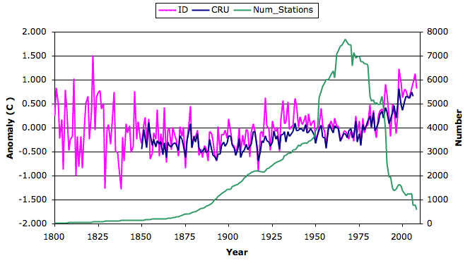
From this we conclude that whatever compensation CRU and NCDC make for urban heating, station disappearance, and geography, their compensation has no significant effect upon their result. But station disappearance does have a significant effect upon the underlying data, as we show
here. Thus we conclude that CRU and NCDC performed no compensation for the disappearance of stations. Because station disappearance and urban heating are intimately linked by the expansion of cities, we suspect that CRU and NCDC performed no correction for urban heating either.

"their compensation has no significant effect upon their result"
ReplyDeleteNo: what you've done is shown that a straight average happens to give a similar result to the proper, geographically distributed result (with whatever other adjustments are made). I'm actually a little surprised - unless the data you are working with are time-of-observation adjusted, that means your samples are disproportionately located in fast warming regions (since TOB adjustments to compensate for moving midday measurements to the morning yield a strong warming).
Therefore, when you do the disappearance analysis, you may now have a geographically skewed set. In fact, my understanding is that a lot of Russian rural stations dropped out, so that rather than seeing the loss of "fast warming" urban heat islands, your algorithm is no longer appropriately weighting the fast warming Russian northlands.
I would suggest that you compare the geographical locations of station dropouts to this GISStemp map: http://tinyurl.com/yjqtv6c
That would be easier than coming up with your own geographic weighting algorithm, and you can see whether the locations correspond more to urban areas or the Russian hinterland...
-Marcus
Unless comments are held for moderation without any sort of notice to the commenter, this comment facility does not work with Firefox on Mac. So I'll try for the fifth time, this time with Safari:
ReplyDeleteYou have calculated the average of the stations' temperatures, which is of interest to no one. What is of interest is the Earth's average temperature, which must be calculated with a single temperature per geographic grid square.
Your failure to grid the data resulted in over-weighting of the geographic areas (grid squares) that have multiple stations. And guess which stations are most likely to be dismantled ("disappeared")? Those are the stations that are redundant with other stations by virtue of being in the same geographic area. And of a given set of redundant stations in the same area, guess which ones are most likely to be disappeared? The ones in the worst spots.
So by failing to grid, you have over-weighted the worst stations, thereby amplifying the effect of removing them.
Dear Anonymous, I'm tyring to understand your comment. You talk about the "average anomaly". So far as I can tell, you seem to think that we are using the average anomaly to mimic the CRU curve. It's true that we show a graph of the average anomaly, but that's not how we generate the CRU trend. Please scroll down below the average anomaly graph to the point where we describe how we take the derivative of the anomaly and then integrate. Kevan
ReplyDeleteDear Marcus, So far as I understand it, you're saying it's just a coincidence that we can generate the CRU and NCDC trends from the raw data without accounting for geography, station disappearance, or urban heating. There is no experiment I could perform to falsify your claim. No matter how closely our results matched the CRU and NCDC curves, you could always say that it's a coincidence. Our claim, meanwhile, is that for any set of station data, our method of integrated derivatives will give almost exactly the same trend as the CRU and NCDC analysis. You can disprove our claim easily, by applying our calculation to any set of data for which you have the CRU or NCDC curves. If our method fails to reproduce the CRU or NCDC curve, our claim is falsified. Thus, our claim is falsifiable, while yours is not. You may be right, but your theory is not scientific. Our theory may be wrong, but it is scientific. If you want to argue against our claim, the only way forward is for you to check it with some programming and analysis of your own. Talk has very little weight when falsifying scientific theory. I am confident that you will find our theory is sound, but I will be delighted if you find that our theory is wrong. Kevan
ReplyDeleteDear Anonymous, With respect to attempts to post using anonymous ID, I tried with Firefox on Windows, and observed that anonymous comments take a few minutes to show up, while posts from a Google ID appear immediately. I apologize for your frustration with the site. Kevan
ReplyDeleteKevan,
ReplyDeleteI'm trying to find all the raw data that I can find. Here is the - US Station Daily Data: Access by State http://www.esrl.noaa.gov/psd/data/usstations/. The time series is only from 1950 to 1999 but I would love to see what you could do with it. I will keep looking. Mabye you could have a mirror page to that RC "alarmist" links page, to let the "skeptics" try to uncover some raw data sets for you. I'll keep hunting. Good luck.
Joe V.
Kevan, you wrote "The excluded half must have contained a trend of roughly 0.4°C. It might be that the remaining half of the temperature sensors also included a false trend of 0.4°C due to urban heating."
ReplyDelete"Also"? You are only speculating that urban heating is responsible for the higher trend of the excluded stations. You don't even have any evidence that the excluded stations' higher trend is less correct than the non-excluded stations'. Equally plausible is that the excluded stations are more, not less, representative of the true temperature.
Here's one scenario: The stations most likely to disappear are rural stations that are more representative from the moment they are installed, standing with no urban encroachment ever, until due to their remoteness they are abandoned. Eliminating them from the data makes the data less correct, not more correct.
One clue is a comparison of your trend after excluding the stations, to the trends from ocean and satellite observations. Does your exclusion make your trend more or less like those trends that are immune to urban heating?
Another clue is that all the previous studies have found the urban heating effect on official climate temperature records to be anywhere from none to trivial.
So your speculation is pitted against equally plausible explanations and a bunch of solid evidence.
-- Tom Dayton
Dear Joe V, I'm happy to calculate our trend on new sets of station data, but how am I going to calculate the NCDC or CRU trend to compare? So, if you have the NCDC or CRU trend calculated from that set of data, I'll do it. Kevan
ReplyDeleteDear Tom, You make some good points. It could be that the disappearing stations are rural, and that the warming they see is real. I have no evidence either way. You mention "previous studies" showing that urban heating is negligible. I'd like to see some of these studies. Every study I have seen shows that the effect is large, such as this and this. What we show with our method of integrated derivatives is that disappearing stations have a systematic effect upon the data, and that neither NCDC nor CRU took account of this effect when they calculated their trend. After that, you and I run into a difference in philosophy. My job is inventing new measurement instruments, determining their accuracy, and providing them to physicists and medical researchers. My philosophy is to announce a level of accuracy only after proving beyond reasonable doubt that the instrument can achieve this accuracy in all conditions it's likely to encounter. It appears that your philosophy is to trust a measurement until someone proves beyond reasonable doubt that the measurement is inaccurate. My philosophy is the one that gave science such a great reputation for producing reliable results. So, please understand that from my perspective: the NCDC and CRU curves are riddled with unknown systematic and stochastic errors. At best, they are good to ±0.1°C/decade, which means that their +0.6° trend in 60 years is not significant. They should say +0.6±0.6°C. Certainly, this trend is not adequate grounds to ignore the simultaneous decline in the Briffa tree ring measurements.
ReplyDeleteKevan, you are reading selectively. The second of the studies you cited says:
ReplyDelete"Whilst some temperature records from small towns do not represent the large scale climate, it is unlikely to have any major impact upon our estimates of temperature warming over Australia. This is because there are numerous other weather stations located in remote areas such as lighthouses and regions far removed from urban areas that still indicate a warming temperature trend."
-- Tom Dayton
Yes indeed, I am reading selectively: when someone presents data, I remember it, when someone expresses their opinion, I forget it. The study shows urban development around a weather station causing warming of around 2°C. At the end of the study, the authors express their opinion that urban heating is rare in the Australian data set. They offer no data to support their claim. Furthermore, their claim seems like nonsense to me. The study shows urban heating producing a systematic error in one location of 2°C over half a century. It is up to NCDC and CRU to show that urban heating does not have a significant effect upon their trend. They must make their proof with experiments and data, not with argument by authority, or argument by sounding very reasonable, or argument by how incredibly difficult it is to plan and execute such experiments. Until they have shown by experiment that urban heating is not a significant contributer to their trend, I won't believe their trend is accurate to ±0.1°C/decade. If you want to believe it, go ahead.
ReplyDeleteKevan, the first study you linked to says "Finally, on the global or hemispheric scale, it may be of interest to perform bulk-type studies with daily temperature and wind direction data, taking into account the position of stations compared with the urban areas." That has been done at least for the U.S., for windy versus non-windy days; that study is among those you can find from my below links.
ReplyDeleteYou said you'd like to see studies showing the urban heat effect is inconsequential for the climate instrumental temperature record. Instead of copying all the citations here, I'll link to sites that have those citations. Feel free to ignore the other contents of these sites, if you believe them to be biased. Just use the citations in the sites to find the scientific articles that the sites discuss, then go read those articles yourself.
Barton Paul Levenson provided a list in his comment to David Cook on RealClimate.
For an accompanying explanation along with more citations, see SkepticalScience.com's Is the U.S. Surface Temperature Record Reliable?. See also the Skeptical Science Does Urban Heat Island effect exaggerate global warming trends? and Are surface temperature records reliable?.
And for whatever it's worth (since Wikipedia postings are open to editing by a wide variety of people) there is the Wikipedia entry: Urban Heat Island: Relation to Global Warming.
With regard to the most recent NOAA study that contrasted supposedly "good" stations against all the stations, see my comment at Accuweather that starts "Posters at WUWT".
The following greenman3610 video is opinionated, and is redundant with the citations that are embedded in the above sites, but (now that you're warned) you might consider watching Watt's Up With Watts?.
-- Tom Dayton
Tom, Nice work, sir. I enjoyed your comment very much. I consulted all the references, and listened to half the video (stopped when they started with the ad-hominem attacks, I'm squeamish that way). Read your post too, and agree with it. Now, I'm not surprised by the results of these studies into urban warming. Correct me if I'm wrong (spent only twenty minutes reading them), but it appears that they are looking at the difference in the warming trend you would see at a long-term rural station as compared to a long-term urban station. I don't see why there would be a difference in the trends. The fact that urban areas are warmer is confirmed by the plots, but I would expect the trends in long-term rural to be the same as long-term urban. An ambient increase will affect the urban temperature equally. But my point is not that urban stations show a different trend. My point is that stations that are overtaken by urban development show a warming trend that is far larger than the atmospheric trend. More specifically, my point is that disappearing stations can be associated with any number of systematic trends as they approach the moment of their disappearance. In the case of the global trend from CRU and NCDC, we lose 80% of the stations in forty years. After that, the number of stations remains constant, and sure enough, in the past ten years, we have a slight decline in global surface temperature (not that I trust it to better than ±0.1°C, as I have said). So, when we see Briffa et al. showing a decline after 1960, we have a measurement of temperature that is decidedly rural, showing a downward trend. Of course, the tree ring is no great thermometer, but nevertheless, this downward trend should not be discarded, but rather should give us caution about the global surface trend from thermometers. With our analysis of the disappearing stations, we show that their inclusion or exclusion affects the trend in the data. They are not all duplicates. Even if many are duplicates, as your own references show: a thermometer in St. James's Park and another in The City both give us a good measure of the trend, helping to improve our accuracy. So, I look forward to hearing what you have to say about that, and I thank you for your thorough and enlightening discourse.
ReplyDeletePosting trouble: I find I have to press "Post Comment" twice to get it posted, and Peter in Australia says his post was rejected outright. I will look into this tomorrow. Kevan
ReplyDeleteKevan, you wrote "But my point is not that urban stations show a different trend. My point is that stations that are overtaken by urban development show a warming trend that is far larger than the atmospheric trend."
ReplyDeleteBut as rural stations are overtaken by urban development, they become "urban" stations. If that overtaking is accompanied by greater warming trends, then it logically follows that stations that already are urban are warmer than rural stations. Otherwise, being overtaken by urbanization would have no effect on warming trend of stations.
That's why the studies are relevant. They find no greater warming trend among urban stations than among rural stations. Those urban stations include ones that originally were rural, along with ones that originally were urban.
-- Tom Dayton
Kevan, you seem to keep assuming that the disappearing stations are rural stations that were overcome by urbanization. Again, you have zero evidence for that. You have no idea whether the disappearing stations are urban or rural, or were originally rural and became urban, or were originally urban and became rural. You don't know if they were better quality of lower quality. Indeed, you have no knowledge of the properties of any of them, except for (I presume) their country and closest WMO station.
ReplyDeleteIt is perfectly legitimate, however, for you to say that the disappearing stations' last twenty years of temperature trend is steeper than the non-disappearing stations. And sometimes you do say that, which is great. You are making an interesting observation, but anybody's explanations for it are completely speculative. So how about phrasing it as a mystery to be solved, and clearly labeling as hypothetical, as many different explanations as you can think of?
Then think of ways to test each of those explanations.
-- Tom Dayton
Kevan, with Firefox on the Mac, using the Name/URL profile just causes the typed comment to vanish. No preview, no error message. Ditto when using the Anonymous profile. Same result whether you click the Post Comment button or the Preview button.
ReplyDeleteWith Safari on the Mac, the Name/URL profile does not work (I don't remember what happens). Anonymous works, but not if you click the Post Comment button. You must instead click the Preview button, which always results in an error message above the Post A Comment box, and only then does the mystery word appear with its input field. Typing the mystery word and then clicking the Preview button again after that seems to always post the comment, but sometimes it does not display the comment until you refresh the page.
-- Tom Dayton
Kevan, I think a big part of the misunderstanding is that you are assuming stations that are "urban" when their temperatures are being used, have been urban their whole lives and have been in cool islands their whole lives. That is not the case. "Urban" stations include those that have always been in urban cool islands, those that have always been urban but only sometimes in cool islands, rural stations that have become urban, and all other combinations.
ReplyDeleteBecause all those types include the stations that transitioned from rural to urban over the last twenty years of their lives, the studies I pointed you to did indeed study those stations, too--stations at various stages of going from rural to urban. So those studies are indeed entirely relevant to your hypothesis.
Also, if you think studies in the last ten years aren't relevant because the number of disappearing stations has decreased so much in that time, please note the dates in which those studies' data were collected. (Note that the date of publication of a study is later--sometimes years later--than when the data were collected.)
-- Tom Dayton
Kevan, I suggest you read the RealClimate post No man is an (Urban Heat) Island.
ReplyDelete-- Tom Dayton
Kevan, you wrote "in the past ten years, we have a slight decline in global surface temperatures (not that I trust it to better than +-0.1 deg C."
ReplyDeleteNo, there has not been a decline. Most importantly, the continued warming (though slower recently) is evident not just in land surface measurements, but also in ocean measurements, which of course are not subject to stations being overtaken by urbanization.
But even in surface measurements, we have not been cooling:
In cce's The Global Warming Debate: Chapter 4, The Temperature Record
On SkepticalScience.com:
* Did global warming stop in 1998?
* Global warming stopped in 1981... no, wait! 1991!
* Global cooling: the new kid on the block
More-technical posts by Tamino:
* What if...?
* Stupid is as stupid does
* Breaking Records
* Dangerous Curves
-- Tom Dayton
Tom, We agree that the integrated derivative showed that disappearing stations introduce a positive temperature trend. I agree that I did not show any evidence that this trend is due to urban heating. Nor did I claim that I was certain urban heating was involved. But note that I'm on the skeptical side of the argument: I'm asking for proof that a measurement is accurate, having just shown that it has significant systematic problems. I'm proposing one possible explanation for the heating trend contained in the disappearing station data. According to my own process of scientific discovery, I do not have to prove that my skepticism is justified.
ReplyDeleteNow, you say that the studies you pointed to showed no heating trend as urban development takes place around a weather station. I cannot find anything in the studies to back up your claim. Indeed, such a claim contradicts many studies I have looked at, including the two I have sited, and my own personal measurements of temperature in and around buildings, and in large experiments like the ATLAS detector at LHC, where my group is responsible for monitoring temperature in a 4,000 cubic meter volume with thousands of thermometers.
As to my unproven hypothesis of disappearing stations, let me make it more specific. Suppose we had 100 stations and there was no underlying change in average annual temperature. Every decade, we lose 20 of these stations. Of these, 15 are rural and lack funding. The other 5 are engulfed by a town and the land sold for a big profit. As these 5 are engulfed over 10 years, they experience urban warming of order 2°C. Averaged over the 100 sensors, we see a net warming of 0.1°C/decade, and this continues until we have only 20 stations left. These, it turns out, are here to stay. Now the trend stops.
You say temperatures have not declined in the past ten years. Well, I'll agree that we don't know what temperature has really done. But the satellite data and the global surface data show various negligible trends, some negative, and there are several e-mails in the Climategate hack that show Jones and others saying they cannot account for the lack of warming. Given that they fiddled the Briffa data, who knows what they did to their global surface data in the last ten years. I can't trust anything out of CRU or NCDC or NASA any more. One fiddle in open sight means a hundred we can't see. They meant well, and they believed in what they were doing, but they did not follow the scientific method as I know it, so I can't trust them.
As to posting trouble, It sounds like the posting on this side hardly works at all. If anyone else is having trouble, please try with a google account, which is easy to open, and maybe you will have more success. I'm not sure how to start interrogating Google, who hosts this site for free, bless them.
ReplyDeleteI'm going to try posting my comment in small bites, because your blog software gave me an error page when I tried to post the entire thing at once, despite the Preview not complaining, and despite the error page saying nothing about length.
ReplyDeleteKevan, I wrote earlier that you have an interesting observation of the trend being less steep when the disappeared stations' last 20 years of data are dropped. I suggested you list all the hypotheses you can think of, to explain that.
The number one hypothesis needs to be that the trend difference is an artifact of the difference between your treatment of the data and CRU and NCDC's treatment of the data. That includes both your integrated derivative mathematical transformation (which CRU and NCDC did not do), and your lack of gridding and other adjustments (which CRU and NCDC did do). The hypothesis is that if you did the same dropping of stations but then followed all the procedures that CRU and NCDC follow rather than your own procedures, you would not see the trend be lower when the disappeared stations are dropped.
I'm not claiming that hypothesis is correct! I'm merely stating that it is such a strong hypothesis that it needs to be addressed before considering any other hypotheses. If that hypothesis is correct, then there is nothing of interest to explain.
That hypothesis of mathematical side effect of your procedures is what the commenter Marcus was getting at. Marcus did not write nor mean that the similarity of your all-stations-raw-data trend to CRU's adjusted-data trend was a mere "coincidence." Rather, the differences between your processing and CRU/NCDC's processing seems to have preserved enough of the information for the overall trends (before dropping stations) to be similar. Note that the trends are not the same, only similar, and the variations around your trend differ from the CRU/NCDC data's variations. Like Marcus, I am surprised by the similarity of the two trends. My guess is that both your data set (before dropping stations) and the CRU/NCDC's data set are such enormously larger samples than necessary to accurately represent the temperature population, that they overwhelm any distortions by your mathematical procedure for that particular trend without dropping stations.
(to be continued)
-- Tom Dayton
(continued from my previous comment)
ReplyDeleteBut it is not legitimate to conclude from the similarity of that particular result, that your transformed dataset is a valid proxy for doing any sort of further processing and comparisons. In particular, it does not guarantee that it will yield the same result from your procedure of dropping out the last twenty years of the disappeared stations.
A basic and classic example of the limitations that data transformations impose is nominal, ordinal, interval, and ratio levels of measurement. I'm not saying that those are the particular limitations relevant to your procedures; I'm merely listing them as a simple example. This topic of measurement can get very complicated; here is just one semi-randomly chosen example.
The most convincing way to demonstrate that the lower trend from dropping stations is not an artifact, is to do all the processing the same way that CRU/NCDC do it. If you were trying to publish your results in a peer-reviewed scientific journal, that's exactly what you would have to do.
Second best is to get a professional statistician to opine. You should ask Tamino on his Open Mind's Open Thread #16. Ask nicely, though. And apologize up front for the provocative, premature, over-general, and over-confident claims you have on your site, such as "Thus we conclude that CRU and NCDC performed no compensation for the disappearance of stations. Because station disappearance and urban heating are intimately linked by the expansion of cities, we suspect that CRU and NCDC performed no correction for urban heating either." Tell him that you're just an enthusiastic amateur in this field and when you wrote those words you were unaware of many of the statistical issues.
-- Tom Dayton
Dear Tom,
ReplyDeleteIn physics, a measurement is inaccurate until proven accurate. That's how we like it. If you want to trust a measurement until it's proven wrong, you go right ahead.
Our method of integrated derivatives will almost always reproduce the CRU trend from the same data set. Their CRU grid system is a form of step-wise averaging, and their trend generation is a stitching together of integrated derivatives. Our method is the same method, minus a bunch of redundant stuff like the grid and the stitching. Isn't that obvious to you? I assumed it was. It's obvious to me and to my colleagues in computer science, physics and engineering.
So far as I can tell, all studies agree that urban development causes a warming trend so long as the development continues, but stops when the development is complete. You suggested otherwise. I asked you to support your statement. You did not provide support. Please correct me if I am wrong.
We reproduce the CRU trend with our streamlined calculation. We show that disappearing stations introduce a warming trend into the data. We postulate, but do not prove, that urban development is responsible for a significant fraction of the disappearances, and hence the apparent heating. Meanwhile, tree rings show a decline in temperature after 1960 and the CRU warming trend almost stopped after 2000, when the stations stopped disappearing.
For me, these are ample grounds to distrust the CRU trend. I apply the same standards to the Briffa trend, and arrive at the same conclusion: I don't trust it. So far as I am concerned, the world could be 1°C warmer now than 100 years ago, or 1°C cooler. Neither would surprise me.
Yours, Kevan
Kevan, you wrote "Correct me if I'm wrong (spent only twenty minutes reading them), but it appears that they are looking at the difference in the warming trend you would see at a long-term rural station as compared to a long-term urban station."
ReplyDeleteYou are wrong. As your correction, let's take, for example, Hansen, et al. (2001):
In 1940, a county agricultural agent sets up a weather station in a clear spot in between cornfields in the middle of nowhere, Missouri.
Between 1940 and 1950 a farmhouse is built near the weather station, and the nearby town of Hooterville has grown large enough to have a school.
In 1963 the new residents of the farmhouse install electricity to the house for the first time, so they can plug in the toaster they brung from Manhattan. The county population has increased to 3,000.
By 1975 Hooterville has grown to surround the farm.
By 1980 Hooterville has grown so much that Oliver and Lisa sell the farm to a developer and move back to Manhattan. Owing to campaigning by the new county agent, Hank, the weather station remains in its original location, surrounded now by a large park that nonetheless is considerably smaller than the original farmland.
By 1990 the weather station's surrounding park has had its size reduced drastically and its edges built up with houses.
By 1997 the weather station sits still in its original location, but now in a six feet by six feet gravel patch surrounded by pavement and tall buildings, on account o' the growin' together of Hooterville, Pixley, Crabwell Corners, Stankwell Falls, and Bugtussle.
In 2004 the weather station is dismantled. On that date every year thereafter, mysteriously there appear on the sidewalk that now covers that spot, the muddy hoofprints of a pig.
(to be continued...)
(...continued from the previous episode:)
ReplyDeleteIn 1997, satellites detect bright light at the weather station's location. So in 2000 Hansen, et al.'s urban heat adjustment algorithm uses that info to classify that station as "urban."
The algorithm now looks at the temperature anomalies (compared to the 1961 baseline) for that station for all years since its installation in 1940 until 1999 (the last year of data that existed when Hansen et al. did their study). It computes the trend of those anomalies from 1940 (the station's inception) until 1950 (the hinge year for the algorithm's adjustment).
Because that station is (based on 1997 satellite imagery) classified as "urban," the algorithm also looks for stations within 500 km of the pig's station that the satellite (in 1997) saw in unlit areas. The algorithm finds one 300 km away, classifies it as "rural," computes its individual yearly anomalies from the 1961 baseline, and computes the trend in those anomalies from 1940 (when the pig's station's data began) until 1950. The algorithm finds three more rural stations within 500 km and does the same calculations for each of them, individually. Finally it computes the average of those four rural stations' trends.
Now the algorithm reduces the trend of the pig's station's anomalies until it matches the average trend of those four rural stations. That completes the urban heating adjustment to the pig's station, but only from the station's inception to 1950. Since only tiny urbanization happened in that period (see episode 1 above), the pig's station's trend was only a tiny bit steeper than that of the still-rural-in-1997 stations, and so the trend adjustment was tiny.
Now the algorithm repeats all the above, but for the period 1951 through 1999. The difference in trend between the pig's station anomalies-from-1961 and the still-rural-in-1997 stations got increasingly large through that period; the gap between the trend lines grew larger from 1951 until 1999. The algorithm responds by shallowing the pig's station's trend of anomalies-from-1961, shallowing less at the 1951 end and more at the 1999 end, until the entire trend laid on top of the anomalies trend of the rural stations. That completes the urban heat adjustment of the pig's station from 1951 to 1999. Since the gap between trends went from tiny to larger across the period 1951 to 1999, the adjustment was correspondingly tiny to larger.
The algorithm has removed the progressive urban heating from the pig's station as that stationary station went from rural to urban via the change of its environment from rural to urban.
Across the dataset of all stations, the above-described adjustment for urban heat effect needed to be only very small to eliminate the trend difference due to urban heating, including the gradual overtaking of formerly rural stations by urbanization.
So if the effect of disappearing stations that you (Kevan) are seeing is much larger than that very small urban heating effect found by Hansen et al., then the majority of that disappearing stations effect cannot be due to urban heating.
-- Tom Dayton
Kevan, back to hypotheses for your disappearing stations effect, which I still think is interesting despite evidence against the one hypothesis of progressive urbanization being the cause:
ReplyDeleteThere is more than one independent variable in your experiment. You've dropped stations not just because they disappeared before 2006, but also because they existed before 1950. And you dropped only their last 20 years of data.
What trend do you get if you drop the last 20 years of data from all stations that existed before 1950, regardless of whether they ever disappeared?
What trend do you get if you drop all the years of data from those disappeared, older-than-1950 stations? Then repeat for all the stations that existed before 1950 regardless of whether they disappeared.
What trend do you get if you drop the last 20 years of data for all stations that disappeared, regardless of whether those stations existed before 1950? What if you drop all the data from those stations--not just the last 20 years of data?
-- Tom Dayton
Kevan, you wrote "Even if many [stations] are duplicates, as your own references show: a thermometer in St. James's Park and another in The City both give us a good measure of the trend, helping to improve our accuracy."
ReplyDeleteDuplicates can improve accuracy only if processed correctly to suit your purpose. If you put an extra 1,000 thermometers all in St. James Park, distributed representatively throughout the park, and your goal is to improve your knowledge of the average temperature of that park, then you've succeeded when you find the average temperature of all those thermometers in the park.
But what if your goal is to improve your knowledge of the average temperature of the single geographic area that includes that park and The City? You actually decrease that knowledge if you simply average together all those 1,000 park thermometers with the one in The City, because you've overweighted (over-represented) the park's temperature. But you can change your processing of the same data to instead improve your knowledge, by "gridding": Making the park be one grid cell, averaging the 1,000 thermometers in the park to produce a single temperature for that grid cell, and then average that cell's temperature with the single temperature from other grid cell that includes The City's thermometer. (Of course, you must have grid cells all of the same size that uniformly cover the entire geographic area you're interested in.) That won't give you much of an improvement in knowledge about the entire geographic area, but at least you haven't decreased your knowledge.
In reality, CRU and NCDC do not always simply average all the station's temperatures within each cell. They use duplicates to check for outliers, sometimes drop outliers, sometimes average,.... They also take account of the statistical problems that can arise from unequal information in each cell. (A really simple example: The average of the sums is not always the sum of the averages.) Their methods are described in publicly available...publications.
-- Tom Dayton
Dear Tom,
ReplyDeleteThanks for your arguments and links.
I looked through the Hansen paper. I see they make a correction for urban development of -0.06°C for the period 1990 to 1999. So they believe that urban development does cause warming of the order 0.1°C/decade, which is what I'm suggesting. I can perfectly well believe that certain stations subject to urban development show no trend at all. In my lab, we use fans to get rid of stable thermal layers so as to allow light to travel in a straight line. I think you said earlier: wind is critical.
I see on Page 20 of the Hanson paper that the raw data, from urban stations shows a warming of 0.26°C, but after all their adjustments, the warming rises to 0.47°C, and for unlit stations, the same adjustments change a −0.15°C change into a +0.39°C change. I am not satisfied by the methods described in Hanson's paper for determining adjustments. I am intrigued by the algorithm you described, but not satisfied by it. Furthermore, after seeing how Jones, Schmidt, and Mann faked the last 40 years of the Briffa tree ring graph in 1999, and ignored it in 2009, I'm not inclined to trust any data-fiddling on their part.
Our US station plot does not show as much warming as our global trend. Our Disappearing Station example uses the entire globe's station set. I don't know what would happen if we performed the same test upon the US data.
The integrated derivatives method is exactly the same as the CRU and NCDC's, except we avoid several complications that we believe to be both ill-conceived and undesirable. I discussed how best to prove this point with a friend of mine this morning. The difficulty in explaining the equivalence is that if you can't see it right away, then there's a large gap in understanding that needs to be bridged, and only a dedicated reader is going to cross that gap. Another obstacle is that each reader has their own picture of the complex CRU calculation. Nevertheless, I shall attempt the explanation this weekend, and I would be greatly honored if you would take a look at it for me when I'm done.
I agree with all your suggestions about new sorts of the global data. I'd also like to sort according to location, to extract northern and southern trends. I figure I should sit down and do all of them at once. But I don't have a table that relates station code to latitude and longitude. Do you have any idea where I could obtain such a table? With that table I could put together a "trend calculator" program and everyone could play with it, and select regions and sort criteria, and so on. That would be cool.
So, any help with relating station codes to locations would be greatly appreciated.
Yours, Kevan
Is this link useful http://www.locationidentifiers.org/location-identifier-list.htm
ReplyDeleteThank you Peter (for I hear it is you). I went to the main page, Location Identifiers and downloaded the Excel spreadsheet. It has the identifiers, latitudes, and longitudes. So now I can sort by location. Will get to this later in the week.
ReplyDeleteKevan, Tamino has just put up a concise and excellent post on the last 10 years of temperatures: http://tamino.wordpress.com/2009/12/07/riddle-me-this/
ReplyDelete-- Tom Dayton
Interesting. The writer picks 1980 to 2000, fits a straight line, shows the upward slope, draws some error lines, and says the period 2000 to 2010 is consistent with his upward slope. But if he were to fit a straight line to the 2000 to 2010 data, he'd get a downward slope, which is what skeptics have been saying. So I guess I don't get it.
ReplyDeleteTom, I asked Tamino why he did not show the slope of the 2000 to 2010 period, and my comment was declined by the moderator. I'll try again.
ReplyDeleteWell, how about that, Tom. Tamino will not accept my comment asking why he did not calculate the slope from 2000 to 2010. I guess he found my question to be inconvenient.
ReplyDeleteYes, he did, though maybe with a delay. He replied in-line within your comment, telling you that he added an "Update" above the entire comments list--at the bottom of the main post.
ReplyDeleteThank you Tom, my mistake: he did respond. And he's rude, too. None of the scientists I respect are rude. So, the trends he gets are negligible compared to his errors, which is to say: the world did not warm up in the past ten years. I remember being told in 2000 that the next decade would show significant warming.
ReplyDeleteKevan, the "errors" are not "his" errors. They are noise around the signal. That noise level is consistent with the noise level as far back as we have records. You have missed the point that any short (e.g., ten year) period is unlikely to yield a statistically significant rise or fall, because of the known and expected ratio of signal to noise.
ReplyDeleteBut that does not prevent drawing conclusions about longer periods--specifically, the 30 year periods that are in the very definition of "climate."
Meanwhile, you specifically claimed that the slope of the last ten years is negative. Statistical significance is irrelevant in drawing the conclusion that you were wrong, because the slope is positive. That slope might not be statistically significantly different from zero, but it is far more likely to be positive or zero than negative.
No matter that you were "told" by somebody in 2000 that the next ten years would show significant warming. That somebody either was not a climatologist or was not claiming that it would be statistically significant when examined in that isolated 10-year period. That's just not how statistics works.
You're saying there was no significant warming in the past ten years, is that right? So, from 1980 to 2000 there was significant warming. From 2000 to 2010 there was no significant warming. Are we agreed?
ReplyDeleteTherefore, the statement "the world is getting significantly warmer" is not true if we look at the past ten years. We might say "the world WAS getting significantly warmer and WILL SOON be getting significantly warmer AGAIN," but we can't say "It IS getting significantly warmer."
Have I understood you correctly?
No, Kevan, you have not understood correctly.
ReplyDeletePart of the problem seems to be your cross-use of the term "significant" in its statistical meaning with using it in its everyday meaning.
Another part of the problem is the inherent trickiness of making conclusions about multiple statistical tests of different scales in the same trend series. That problem is similar to the problem of making conclusions about sub-tests within a complex multivariate statistical test. It's easy to see the appearance of contradictory conclusions within that set of tests. It's harder to see how those do not really contradict each other, because the conclusions are at different levels.
Here's a thought experiment that goes to an extreme, to illustrate this point in the case of the temperature trend: Pretend that every ten-year span in the entire series has a trend that is not statistically significantly different from zero (flat) at the 95% certainty level (p<=.05). Every ten year span since 1880: 1880-1889, 1881-1890, and so on. You might be tempted to conclude that the span from 1880 to 2009 has no statistically significant trend, since none of the component ten-year spans has one. But suppose the trend of the span from 1880 to 2009 is statistically significant. That might seem to logically contradict your conclusions about all the ten-year spans--if there is a multi-decadal trend, then where the heck is it? In fact there is no contradiction, because this is all about degree of confidence in conclusions.
Thank you for your explanation. I suggest we move this discussion over to my latest post, plotting the UAH troposphere data with the trailing ten-year trend.
ReplyDeleteI followed a link from here, and you sent me to the 'central limit theorem'. Unfortunately, that is not applicable for everything. For example, on Wikipedia page you indicated, it says 'independent random variables'. I'm sorry, but those are not entirely independent. Easy to see for a simple system, with a temperature field governed by the simple heat equation. Temperature values close to a certain picked point will be close to that temperature, not independently random. Now, it's a little more complicated :) for Earth, but true independence must not be assumed.
ReplyDeleteIf we assume independence, we obtain a lower bound on the global surface temperature error, because we are assuming the errors will tend to cancel. If the errors in each measurement are not independent, the error in the average will be larger. If we followed your advice, and refused to assume independence, we would be unable to perform any calculation, and so we would remain without even a lower bound on the error in the average.
DeleteYou are right. I just wanted to indicate that their error might be bigger :)
Delete"The weather stations are not uniformly distributed" - this is called an unrepresentative sample. It's not very good by the same reason why one cannot average the IQs of some picked people in universities and claim that is the average of IQ for the country. I'm surprised they get away with it. For Antarctica interior for example, they have very few stations indeed.
ReplyDeleteIndeed. But if we sample the first ten tosses of a hundred tosses of a random coin, the fact that the coin is random means that these ten are as good as any other ten. So the non-uniform distribution of the weather stations is not necessarily non-representative, so I would not want to call it non-representative unless I could show that average temperature varies in a position-dependent manner.
DeleteI wouldn't try to shift the burden of proof :)
DeleteAnyway, I really doubt they used a coin when they picked the station locations. I find very odd that many of them are close to airfields, and believe me, those are not picked at random. One does not make an airfield in a very narrow small valley or on a mountain ridge, usually.
The same is true for human locations, being cities or villages. Those are usually very close to a water source. Not looking like a random coin at all.
DeleteThat's a good point. We wanted to advance an argument that would place a minimum on the error in the temperature record, and argument that would be hard to counter, other than to say that the errors might be much bigger, which is what you are pointing out.
DeleteThe medieval warm period in England and Greenland has been dismissed by some climatologists as a local phenomenon. If so, then we can go back and re-calculate the error in the global average temperature, assuming that all measurements in 1000 km squares are correlated, and therefore we have far fewer effective samples of the average global temperature, increasing the error.
That's if we had the energy to present the calculation, which I personally don't any more. But I'm happy to answer your questions, and honored that you're reading this stuff.