
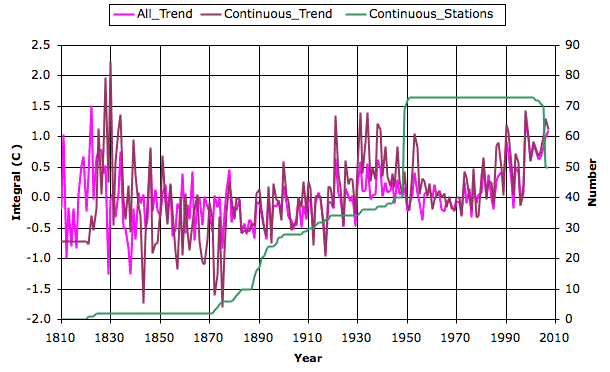
The brown trend is from disappearing stations. The pink trend is the one we get from all stations. They are almost identical. It is the disappearing stations that dominate the NCDC and CRU global surface trend.
The green line is the number of available disappearing stations in each year. There are thousands of them in the mid-twentieth century. The disappearing station trend shows no significant warming during the 1940s, which contrasts with the trend we obtain from continuously-operating stations. But the disappearing station trend does show sharp warming in the 1980s, so that the temperature in the 1990s appears exceptionally warm. Because there are thousands of disappearing stations, they outnumber the continuously-operating stations by a hundred to one. When we combine the two, the disappearing trend swamps the continuously-operating trend. The warming of the 1940s is suppressed by the disappearing stations and the warming of the 1980s is amplified.
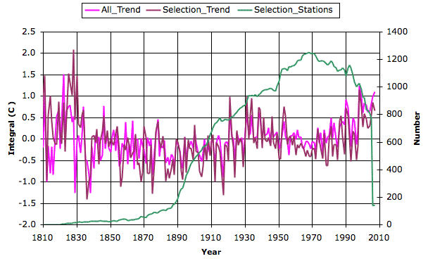
UPDATE: Select stations that report 80% of the time in 1960-2000, graph. Select stations that report 80% of the time in 1840-1880, graph.
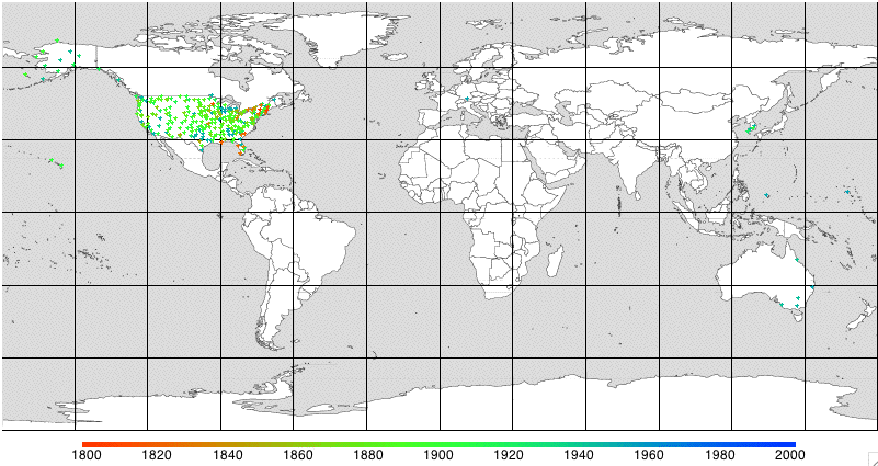
UPDATE: We plotted a map of the locations of the 73 stations that operate continuously from 1960 to 2000, which you will find here. Almost all of them are in the United States.

No comments:
Post a Comment