Intelligent Design and Creationism both propose the existence of a super-natural power, and so cannot be considered scientific theories. This was the finding of Federal Judge John E. Jones, and requires no assumption about the truth or falsehood of either theory. You can read his ruling here. He says, intelligent design "is a religious view, a mere re-labeling of creationism, and not a scientific theory".
Anthropogenic Global Warming makes no claim about super-natural power. Nevertheless, the theory has no empirical basis. Nobody has performed experiments upon the climate to show that increasing C02 concentration causes a rise in temperature and decreasing CO2 causes a drop in temperature. All we have are climate histories of dubious accuracy.
The fact that we have not tested the AGW theory with repeated experiments on the climate means the theory has no empirical basis. It does not matter whether AGW is true or not. It does not matter how many climatologists believe in AGW.
Climatologists protest that they cannot perform experiments upon the climate. They are quite right. They say that they will be unable to make predictions if they are required to perform such experiments. Yes, that is indeed the case. So they say they are entitled to make predictions without experiments. Well, they can do what they like.
For every ten convincing and superb theories I come up with in my lab, only one turns out to be true. That's because I subject my ideas to the test of experiments. Maybe I'm incompetent too, but at least my incompetence is held in check by experimental tests. Climatologists don't have to bother with experiments. They can believe whatever they like. Consensus and Peer-Review are their basis for their theories.
UPDATE: I posted the above statement, or close to it, at The Lippard Blog.
Thursday, December 31, 2009
Tuesday, December 29, 2009
Random Fluctuations
In our previous post, Trends and Noise, we plotted the frequency spectrum of the global surface temperature for the past two hundred years and observed that it looks like red noise. Red noise is the noise we get when the change in a physical quantity from one sample to the next is random, instead of the deviation from some mean value being random. The graph below shows the year-to-year change in global surface temperature for the past two centuries.
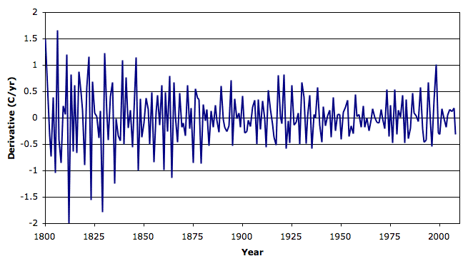
The distribution of these changes is not quite a normal distribution, but it's close. Its average value is 0.01°C for the entire period, and its standard deviation is 0.5°C. For period 1930−1990, its standard deviation is 0.3°C.

At the end of our essay on climate models, we suggest that a good model for the climate is a random change from one year to the next with normal distribution and standard deviation 0.3°C.
We challenged our readers to show that the climate is not dominated by random fluctuations. We posed the same question at Real Climate. We received three forms of answer. One was that the climate has been affected by volcanic eruptions and long-term solar cycles, therefore it is not random. Another was that we must assume things are not random, or else we can't believe in any scientific theory at all. Another was that experiments upon the climate are impractical (see this response from Gavin Schmidt), and because such experiments are impractical, climatologists should be excused from proving their theories with experiments.
We conclude that there is no empirical basis for a belief that recent climate trends are anything but random. Climatologists admit this lack of empirical basis openly, but insist that such a basis is not necessary to justify their belief in anthropomorphic global warming. What we have here is a disagreement about scientific method between those of us who work in physics and those who work in climatology.
UPDATE: Here is another red-noise analysis, shorter term, over at The Reference Frame.
The distribution of these changes is not quite a normal distribution, but it's close. Its average value is 0.01°C for the entire period, and its standard deviation is 0.5°C. For period 1930−1990, its standard deviation is 0.3°C.
At the end of our essay on climate models, we suggest that a good model for the climate is a random change from one year to the next with normal distribution and standard deviation 0.3°C.
We challenged our readers to show that the climate is not dominated by random fluctuations. We posed the same question at Real Climate. We received three forms of answer. One was that the climate has been affected by volcanic eruptions and long-term solar cycles, therefore it is not random. Another was that we must assume things are not random, or else we can't believe in any scientific theory at all. Another was that experiments upon the climate are impractical (see this response from Gavin Schmidt), and because such experiments are impractical, climatologists should be excused from proving their theories with experiments.
We conclude that there is no empirical basis for a belief that recent climate trends are anything but random. Climatologists admit this lack of empirical basis openly, but insist that such a basis is not necessary to justify their belief in anthropomorphic global warming. What we have here is a disagreement about scientific method between those of us who work in physics and those who work in climatology.
UPDATE: Here is another red-noise analysis, shorter term, over at The Reference Frame.
Wednesday, December 23, 2009
Station Distribution
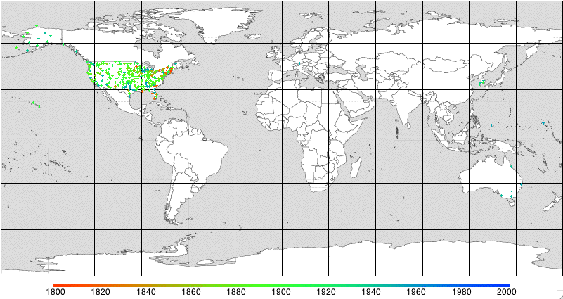
We obtained a map of the world and downloaded the GCHN list of weather stations. We plotted the weather stations on the map. The oldest stations are red and the newest are blue. We plot the older stations last, so the numerous new stations do not cover them up. Click on the figure below for a higher-resolution version, which shows the station colors more clearly.
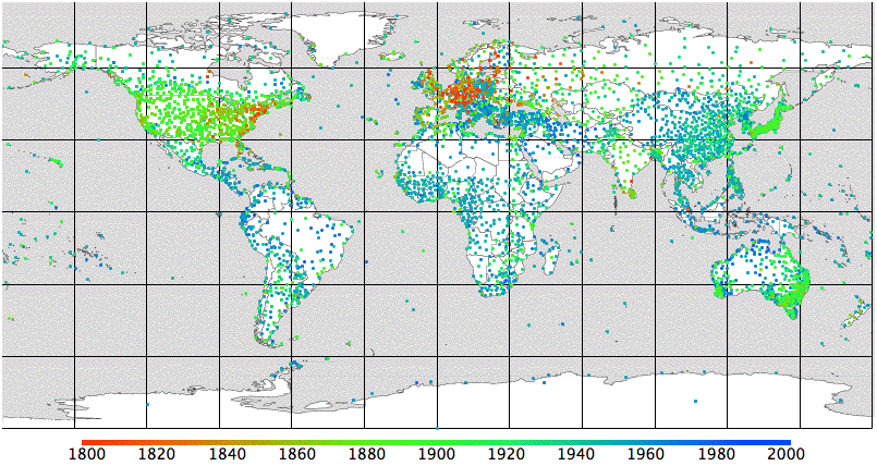
We see early-nineteenth century stations in Europe and North America. In the twentieth century we see the stations spreading across the world, and in particular to nations near the equator. These are the stations included in the GCHN database, which are the ones used by CRU and NCDC to obtain their global surface trend. There are, however, many more stations listed as active today by the WMO. We plot these in a separate graph. In particular, we note the large number of stations listed by the WMO in Russia, but not included in the GHCN database.
We see early-nineteenth century stations in Europe and North America. In the twentieth century we see the stations spreading across the world, and in particular to nations near the equator. These are the stations included in the GCHN database, which are the ones used by CRU and NCDC to obtain their global surface trend. There are, however, many more stations listed as active today by the WMO. We plot these in a separate graph. In particular, we note the large number of stations listed by the WMO in Russia, but not included in the GHCN database.
Sunday, December 20, 2009
Disappearing Stations
Another graph in the Disappearing Stations series, to follow the one we posted yesterday. This graph shows the trend we get from only the final twenty years of a station's operation. We include twenty years of measurements from any station that disappears before 2007.

The brown trend is from disappearing stations. The pink trend is the one we get from all stations. They are almost identical. It is the disappearing stations that dominate the NCDC and CRU global surface trend.
The green line is the number of available disappearing stations in each year. There are thousands of them in the mid-twentieth century. The disappearing station trend shows no significant warming during the 1940s, which contrasts with the trend we obtain from continuously-operating stations. But the disappearing station trend does show sharp warming in the 1980s, so that the temperature in the 1990s appears exceptionally warm. Because there are thousands of disappearing stations, they outnumber the continuously-operating stations by a hundred to one. When we combine the two, the disappearing trend swamps the continuously-operating trend. The warming of the 1940s is suppressed by the disappearing stations and the warming of the 1980s is amplified.
UPDATE: Select stations that report 80% of the time in 1960-2000, graph. Select stations that report 80% of the time in 1840-1880, graph.
UPDATE: We plotted a map of the locations of the 73 stations that operate continuously from 1960 to 2000, which you will find here. Almost all of them are in the United States.
Saturday, December 19, 2009
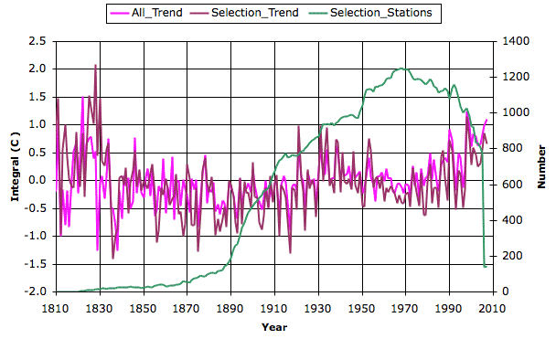
Continuous Stations
We continue our investigation of the effect of disappearing stations and their effect upon the global surface trend. Here's a graph of global temperature we obtain when we consider only those weather stations that operated continuously for a period that includes, but is not limited to, the forty-year period 1960 to 2000. There are only 73 such stations, out of the eight thousand in the global data. The graph shows the number of these 73 available in each year, and compares the trend we obtain from these stations to the trend we obtain from all available stations.
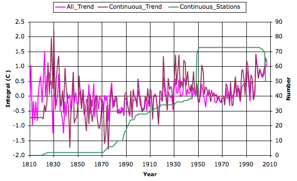
Despite the dramatically reduced number of stations, the new trend is close to the old trend. But the drop in temperature from 1950 to 1970 is greater, so that the rise from 1970 to 2000 is no longer exceptional.
Despite the dramatically reduced number of stations, the new trend is close to the old trend. But the drop in temperature from 1950 to 1970 is greater, so that the rise from 1970 to 2000 is no longer exceptional.
Thursday, December 17, 2009
Weather Station Selection
The Russian Institute of Economic Analysis (IEA) claims that the Climate Research Unit (CRU) used only one in four available weather stations in Russia over the past fifty years (see here for the IEA report in Russian). CRU uses their selection of stations to generate their global surface trend. According to the president of the IEA, "The IEA authors calculated that the scale of actual warming for the Russian territory in 1877-1998 was probably exaggerated by 0.64°C." He claims that the stations selected by CRU are mostly urban, and that the rural Russian stations show no warming in the past fifty years.
Some climatologists appear to have suspected the Russian stations were being selected based upon their warming trends, and tried to publish academic papers on the subject back in 2004. Unfortunately for them, their papers were reviewed by the director of the very same institute they were criticizing. In this e-mail, we see Phil Jones, the director at that time, telling Michael Mann that he rejected the papers.
The station data we obtained from CRU via NCDC may be incomplete. The trend we obtained ourselves may contain an erroneous 0.64°C rise in Russia, which represents 12% of the world's land mass. We do not know how much pre-selection of stations has been done in other parts of the world. We see no evidence of such selection being performed upon US data.
The US data appears to be subjected to corrections instead of selections. For example, according to a NASA Paper, rural stations in the US show a cooling of −0.05°C from 1990 to 1999, but after NASA applies its correction, rural stations show a warming of 0.35°C. Most of this warming is due to what the authors call the "time of observation debiasing" correction. (We did our best to wade our way through this paper and all its corrections, if we have made a mistake, we welcome correction.)
Monday, December 14, 2009
Climate Models
Peter Newnam and I have had a long-running discussion about how models are used in Climatology as compared to in engineering, physics, and astronomy. We concluded that there is are several significant differences, and we have done our best to describe these differences in Climate Models, a new section of our analysis page. It's more of a philosophical piece than a scientific one, but we hope it will at least serve to stimulate debate upon the subject of modeling in science.
UPDATE: Clive James talks about making too many predictions.
UPDATE: Clive James talks about making too many predictions.
Friday, December 11, 2009
Trends and Noise
I expanded our section on climate trends. The graph below compares the fourier transform of the CRU global surface temperature history to the fourier transform of pink noise.
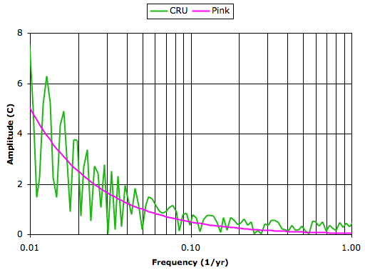
The global surface transform jumps up and down because we have only a few hundred points from which to obtain the transform. Nevertheless, the trend in the transform is clear. The transform follows the pink noise transform up to 0.5 cycles/yr, and flattens out like white noise.
Our recent climate history looks like pink noise added to some white noise. It looks like its a sequence of random fluctuations. I challenge anyone to prove to us that our recent climate history is not random. Until we have such proof, it is our duty to assume that the climate is random.
Tuesday, December 8, 2009
Global Warming
We downloaded lower-troposphere temperature measurements provided by UAH from NSST. The graph below shows the global anomaly from the start of their satellite data-taking in 1978 to the present day. You will find a similar graph for mid-troposphere here. The graph shows the trailing ten-year temperature trend in °C/yr, starting in 1988.
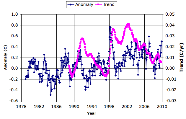
The ten-year warming trend has dropped from a 0.04°C/yr in 2002 to 0.006°C/yr in 2009. Meanwhile, in the mid-troposphere, warming has stopped. So far as we recall, IPCC predictions around the year 2000 said that warming would continue unabated. Perhaps it will start again in a few years, and get going so fast that it catches up with the predictions. Or perhaps not. The anomalies look like random red-noise to me. Good luck to anyone betting their reputation on what the anomalies are going to do next.
UPDATE: Australian farmers don't believe in global warming.
UPDATE: Switching to Google Account comments in hope that this will solve some technical problems.
UPDATE: That crazy temperature trend fools us over and over again.
Sunday, December 6, 2009
Mann-Made Warming
I read the Wegman Report last night, and I think I now understand how Michael Mann's statistical methods produce the Hockey Stick from random input data. I have described the process here. In brief: his method assumes the accuracy of the global surface trend (CRU trend) and calibrates all other series with respect to the rising temperatures of the 20th century. If a series shows a rise in the 20th Century, it is added to the result with greater weight. If a series shows a decline in the 20th century, the decline is flipped around so that it becomes a rise. Data with no trend in the 20th century is added last and with less weight. The result is a hockey stick almost all the time when you combine ten random (red nose) series with the CRU trend.
Saturday, December 5, 2009
Climategate
Phil Jones, director for the Climate Research Unit (CRU) at the University of East Anglia has resigned his position temporarily, pending an investigation into his conduct. Here's an editorial in The Boston Globe and an article in the Guardian. The UN is investigating to see if their own climate data has been corrupted by fraud. Here's an article in The Guardian. The University of East Anglia has appointed an independent investigator, according to the New York Times.
So far, I see three potential examples of scientific misconduct revealed in the Climategate e-mails.
First is the interference with the Briffa tree ring data (see here). Phil Jones of CRU, Michael Mann of Penn State, and Gavin Schmidt of NASA are all involved. In 1999 they altered the data to show warming instead of cooling. In 2009 they curtailed the data to hide the cooling. Every scientist I speak to agrees that both manipulations are deceitful. The perpetrators of the deceit admit to it freely and claim they were doing the right thing.
Second is the destruction of the original tapes and notebooks that held the global land station records. If transcribed and re-formatted digital versions of the original data are available, we have little reason to complain. But if the only versions of the data left have been subjected to several generations of corrections, the loss of the originals is more serious, especially in the light of Phil Jone's attitude towards data correction, as displayed in his manipulation of the Briffa data, and his attitude towards sharing information, as displayed in his admission by e-mail that he had deleted file in anticipation of Freedom of Information Act requests.
Third is what appear to be efforts to subvert the impartial peer-review process in climate science journals. The climate researchers in the e-mails come across as people who believe without doubt that the world is being warmed by mankind, and that anyone who disagrees is contemptible. They sound more like zealots than scientists. Nevertheless, they believed they were doing the right thing.
Thursday, December 3, 2009
Boot-Strapped Trends
The use of artificial corrections, the merging of data from different sources, and the curtailing of graphs to hide trends that conflict with your hypothesis, are frowned-upon in High Energy Physics, Engineering, and Neurology, which are my fields, and according to this eloquent comment, they are frowned upon in Medicine as well.
In my experience, these "tricks" (as Phil Jones calls them), allow us to uphold any hypothesis without supporting evidence. In the case of global warming, the tricks went like this. First, we have a trend from global surface stations, which shows a +0.6°C rise in the 20th Century. We claim, but do not prove, that we have accounted for all sources of error. We now receive other observations of temperature. If these new observations agree with our +0.6°C trend, we accept them. The rumor that ice is melting fast and glaciers are retreating is well-received, as are images of polar bears swimming. These new observations, we claim, give us more confidence in our +0.6°C trend. Observations that disagree with our +0.6°C trend we reject. The Briffa tree ring data is curtailed or "smoothed into instrument data" (Gavin Schmidt) in order to "hide the decline" (Phil Jones's). Satellite measurements showed no rise in temperature when they first came out, but this leads us into a flurry of efforts to find sources of error in the analysis that might have hidden the upward trend that we all know must be there from our many supporting temperature observations. Eventually, one or two groups studying satellite data say they see a slight rise. That's good enough. When we combine temperature histories, we give more weighting to those that agree with our hypothesis than those that disagree (see Mann-Made Warming). Our combined trends look great. Now someone comes and challenges our original global surface trend, and we say, "That actual temperatures have been rising is unequivocal and demonstrated by ocean temperatures, retreating glaciers, melting snow, etc. etc. etc." (Gavin Schmidt).
And so our global warming theory pulls itself up by its own bootstraps.
UPDATE: An interview.
Wednesday, December 2, 2009
Greenland Ice Cores

Tuesday, December 1, 2009
Reliability of Surface Temperature
The main thrust of our Climate Analysis page is that the global temperature we obtain from the surface weather stations contains systematic errors of order ±0.1°C/decade. In the period 1960 to 2000, the number of weather stations dropped from around 8000 to below 2000. The weather stations are not uniformly distributed about the globe. Both CRU and NCDC claim that their analysis of the weather stations accounts for urban heating, disappearance of stations, and poor geographical distribution. But we are able to obtain almost exactly the same curve as them by simply integrating the average station temperature derivative. We did so with only a few lines of code (for description of calculation see here). We took no account of urban heating, no account of station disappearance, and no account of geographical distribution. (See graph below, our trend in pink, CRU trend in blue.)
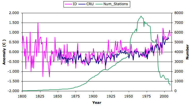
From this we conclude that whatever compensation CRU and NCDC make for urban heating, station disappearance, and geography, their compensation has no significant effect upon their result. But station disappearance does have a significant effect upon the underlying data, as we show here. Thus we conclude that CRU and NCDC performed no compensation for the disappearance of stations. Because station disappearance and urban heating are intimately linked by the expansion of cities, we suspect that CRU and NCDC performed no correction for urban heating either.
From this we conclude that whatever compensation CRU and NCDC make for urban heating, station disappearance, and geography, their compensation has no significant effect upon their result. But station disappearance does have a significant effect upon the underlying data, as we show here. Thus we conclude that CRU and NCDC performed no compensation for the disappearance of stations. Because station disappearance and urban heating are intimately linked by the expansion of cities, we suspect that CRU and NCDC performed no correction for urban heating either.
Subscribe to:
Posts (Atom)
