We continue our investigation of the effect of
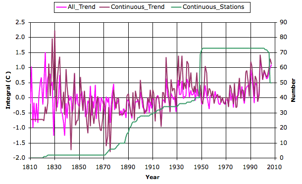
disappearing stations and their effect upon the global surface trend. Here's a graph of global temperature we
obtain when we consider only those weather stations that operated continuously for a period that includes, but is not limited to, the forty-year period 1960 to 2000. There are only 73 such stations, out of the eight thousand in the global data. The graph shows the number of these 73 available in each year, and compares the trend we obtain from these stations to the trend we obtain from all available stations.

Despite the dramatically reduced number of stations, the new trend is close to the old trend. But the drop in temperature from 1950 to 1970 is greater, so that the rise from 1970 to 2000 is no longer exceptional.


This is interesting work. There really do seem to be only 5 spikes between 1930 and 1960 that make all the difference in my perception of the subsequent increase.
ReplyDeleteOf the stations that do not operate continuously, does it make a difference if you show a graph of stations that operated at least 80% continuously? I'm wondering because I can't tell how many of the non-continuously operating stations have significant gaps or not.
I'm not sure if it's rational to draw a conclusion based on a perceptual difference between the temperatures getting back to where they were and rising past where they were - if only 5 spikes make that difference.
Looking at it again, it looks like its the presence of 9 spike data points between 1910 and 1955 in the continuously operating line that make the difference, rather than 5
ReplyDeleteBy special request: the trend we get from stations that reported during at least 35 out of the 40 years from 1960 to 2000. Analysis code is here, and the graph is here. And using the same code, but a different reference period, we have the trend from stations that reported for at least 20 years during the period 1840 to 1880 as well, here.
ReplyDelete