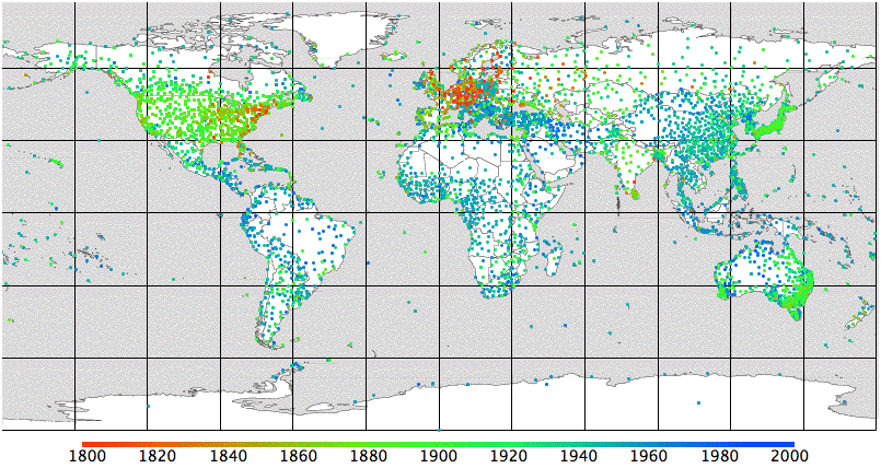
We see early-nineteenth century stations in Europe and North America. In the twentieth century we see the stations spreading across the world, and in particular to nations near the equator. These are the stations included in the GCHN database, which are the ones used by CRU and NCDC to obtain their global surface trend. There are, however, many more stations listed as active today by the WMO. We plot these in a separate graph. In particular, we note the large number of stations listed by the WMO in Russia, but not included in the GHCN database.

Is the GHCN cherry-picking stations?
ReplyDeleteThe WMO stations appear to be much more numerous than the total used by the GHCN. Why would the GHCN not use every single station?
I don't know why the WMO has so many more stations. It may be that many of them don't report often enough, or perhaps they are just locations that no longer have weather stations. I have not yet found a way of getting the WMO data.
ReplyDeleteWhy not do an analysis based on stations from oceanic islands, This would be free of UHI and land use changes so should provide the best possible indication of any global temperature trend.
ReplyDeleteThat's a good idea, and there are quite a few such stations. It does seem possible that a city built up on such an island, around the weather station. But even if that were the case, the ocean island trend would be interesting. I will put this analysis on my list of things to do, and will get to it in a couple of weeks.
ReplyDeleteHi Kevan,
ReplyDeleteYou may find interesting the following article at chiefio.wordpress.com:
GHCN – GIStemp Interactions – The Bolivia Effect
Also of interest are the writer's comments on stations in Arctic canada.
Hugh
Hugh, Glad to hear from you. I may not have read and understood the chiefio post correctly, but it appears at first glance that he is confusing the average temperature of a site and the change in the average temperature from year to year. It is true that the Bolivian mountains, and the Garden Spot in Canada are colder than the stations from by their anomalies are estimated. But the mere fact that a station is colder, on average, does not mean that it is nor warming up, from year to year, at the same rate as a warmer station a thousand kilometers away.
ReplyDeleteThanks for the post and great tips..even I also think that hard work is the most important aspect of getting success..
ReplyDeleteWiFi Weather Stations
Great read, thanks
ReplyDeleteIt's fascinating to see how weather station distribution has evolved over time.
ReplyDelete