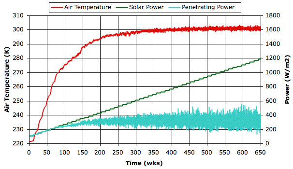
At first, when the sky is clear, the solar power and the penetrating power are equal. But when the solar power reaches 300 W/m2 clouds form and the penetrating power drops below the solar power. As solar power increases from 600 W/m2 to 1200 W/m2, fluctuations in the penetrating power double in their extent, but the average penetrating power appears to remain unchanged. The negative feedback generated by the evaporation cycle is so powerful that the surface air temperature increases by only a few degrees while we double the solar power.
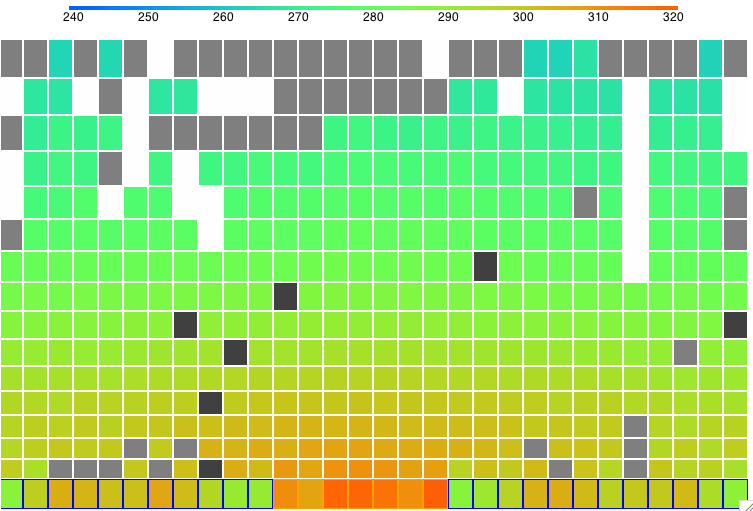
The following screen shot shows the state of the simulation after two thousand hours at 1210 W/m2. You can download this state as a text file SIC_1210W and load it into CC11 to watch the vigorous formation of clouds and descent of precipitation.
We now have the data we need to plot graphs of surface temperature and other properties of the simulation versus solar power.

No comments:
Post a Comment